Your First Widget
Now we get to create our first RAUI widget!
What is a Widget?
Before we create a widget, let's talk about what a widget actually is. To be precise, there are a few different types of widgets and the type widget that we will be creating is a widget component. Widget components are made out of normal Rust functions that have a specific signature. The job of widget components is to look at it's properties and child widgets ( if it has any ), to do any processing that it needs to, and to output a new widget tree that will rendered in place of the component.
Because components can return whole new widget trees, they can combine the functionality of multiple other components together. This allows you to build components into larger structures like LEGO® bricks, where a complex UI can be made out of many simple pieces put together in different combinations. This high modularity is the true power of RAUI, your imagination is the only limit!
Making a Widget
Without further ado, let's make a widget!
Update your main.rs file to look like this:
use raui::prelude::*;

fn main() {
    DeclarativeApp::simple("RAUI Guide", make_widget!(app));
}

/// We create our own widget by making a function that takes a `WidgetContext`
/// and that returns `WidgetNode`.
pub fn app(_ctx: WidgetContext) -> WidgetNode {
    // Our _ctx variable starts with an underscore so rust doesn't complain
    // that it is unused. We will be using the context later in the guide.

    // We may do any amount of processing in the body of the function.
    // For now we will simply be creating a text box properties struct that we
    // will use to configure the `text_box` component.
    make_widget!(text_box)
        .with_props(TextBoxProps {
            text: "Hello world!".to_owned(),
            color: Color {
                r: 0.0,
                g: 0.0,
                b: 0.0,
                a: 1.0,
            },
            font: TextBoxFont {
                // We specify the path to our font
                name: "resources/verdana.ttf".to_owned(),
                size: 60.0,
            },
            // Use the defaults for the rest of the text box settings
            ..Default::default()
        })
        .into()
}
There's plenty of comments in the above example, but there's a lot going on here so lets break it down piece by piece.
Setting the Widget Tree
The first thing we changed was to add our app component to the widget tree in our DeclarativeApp instance.
fn main() {
    DeclarativeApp::simple("RAUI Guide", make_widget!(app));
}
Every RAUI app has a root widget tree that holds the whole structure of application in it. It is essentially the "main" of the UI. In this case we set our widget to a single app component. This is the app component that we define in the function below.
Here we use the strategy of keeping our root widget tree very simple and putting all of our real logic in the app component.
The app Component
Now we get to the definition of our app component:
pub fn app(_ctx: WidgetContext) -> WidgetNode {
As we mentioned before, components are just normal Rust functions with a specific signature. Components are required to take a WidgetContext as an argument and they must return a WidgetNode.
WidgetContext
The widget context is the way that a widget can access it's own state, properties, children, and other information that may be important to the function of the widget. It also allows the widget to respond to events or send messages to other widgets. We will learn more about the WidgetContext later.
WidgetNode
That brings us to what a widget node is. As we mentioned above, there are a few different kinds of widgets. Widget components are one of them and widget nodes are another. The easiest way to think of a WidgetNode is that it is a tree of other widgets. WidgetNodes are most commonly created with the make_widget! macro and filled with builder pattern of WidgetComponent.
Note: There is a third kind of widget is called a
WidgetUnit, but you don't usually need to think about those, since they are the final representation of processed widgets tree.
We can see the make_widget! macro with builder pattern in action in our example:
    make_widget!(text_box)
        .with_props(TextBoxProps {
            text: "Hello world!".to_owned(),
            color: Color {
                r: 0.0,
                g: 0.0,
                b: 0.0,
                a: 1.0,
            },
            font: TextBoxFont {
                // We specify the path to our font
                name: "resources/verdana.ttf".to_owned(),
                size: 60.0,
            },
            // Use the defaults for the rest of the text box settings
            ..Default::default()
        })
        .into()
We use that pattern to create a simple tree with a single text_box component in it and we apply our text_box_props to it to configure how the text box renders the text inside.
Properties
That brings us to the concept of properties. Properties are data, made up of Rust structs, that can be applied to components additively to customize their behavior.
In this case we created TextBoxProps data that we used to configure the text_box component.
        .with_props(TextBoxProps {
            text: "Hello world!".to_owned(),
            color: Color {
                r: 0.0,
                g: 0.0,
                b: 0.0,
                a: 1.0,
            },
            font: TextBoxFont {
                // We specify the path to our font
                name: "resources/verdana.ttf".to_owned(),
                size: 60.0,
            },
            // Use the defaults for the rest of the text box settings
            ..Default::default()
        })
We use the properties to configure the font, content, and color of our text.
We are not limited to using just one struct for our property data. We could add any number of different properties structs to our component, allowing us to configure how the component responds to layout, for instance. We will see how to do more of that later.
Note: You can download the Verdana font or use your own font to follow along. We chose to place it in a
resources/folder adjacent to ourCargo.tomlfile in our Rust project, but you can place it wherever you like as long as you update the path to the font in theTextBoxProps.
Summary
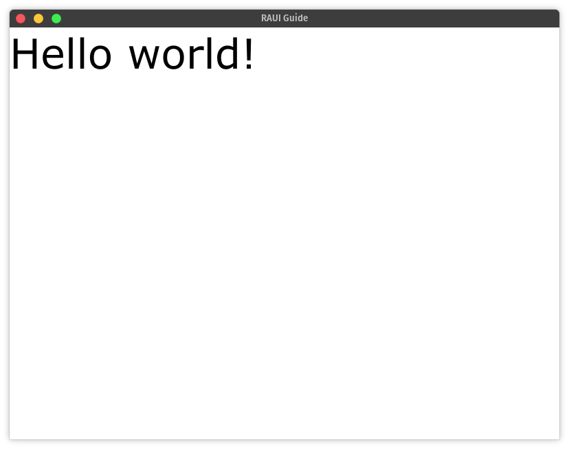
Now that we've explained it all, go try it out! When you cargo run you should get a window displaying your "Hello World!".
Note: You can find the whole code for this chapter here.
🚧 Under Construction 👷
There should be more to this guide but it isn't written yet! If you've gotten this far, congratulations and thank you for reading! Come back later and see whether or not more of the guide has been written.
If you need help or have questions, feel free to open up a discussion on GitHub. 👋